
Most t-shirt designs carry words: a company name, an event, a date, a slogan. The font decides whether people can read them, and whether they survive being printed or stitched onto cloth. A face that looks elegant on a laptop can turn into a smudge on a shirt.
A shirt is not a screen
On a screen you can zoom in. On a shirt, people read your text from a few metres away, while the wearer moves, often in a photograph. Cloth also stretches, folds and has texture. Three things follow:
- Text has to be bigger than you think.
- Strokes have to be thicker than you think.
- Simpler letterforms read better than decorative ones.
Readability at a distance
A useful rule from signage: every 2.5 cm of letter height reads comfortably from about 3 metres, and is still legible from further away in good light. A back print meant to be read across a ground or a hall needs letters several centimetres tall. A left chest logo is only meant to be read up close, at a conversation's distance.
What helps reading at a distance:
- Sans serif faces with even stroke widths and open shapes.
- Medium to bold weights. Light and thin weights disappear.
- Generous letter spacing. Letters that touch blur together.
- Short lines. A slogan of three words reads faster than ten.
- Upper and lower case for longer phrases. All capitals suits short words only.
Minimum sizes
These are general rules of thumb used across the trade; your mockup shows the real result.
For print
- Text height: about 3 to 4 mm at the very least for small text, such as a website address under a logo. Bigger is safer.
- Stroke thickness: no thinner than about 0.5 mm. Hairlines break up or fill in.
- Screen printing: very small text and fine lines can fill in as ink spreads.
- DTF and DTG: hold fine detail better, which helps small text.
For embroidery
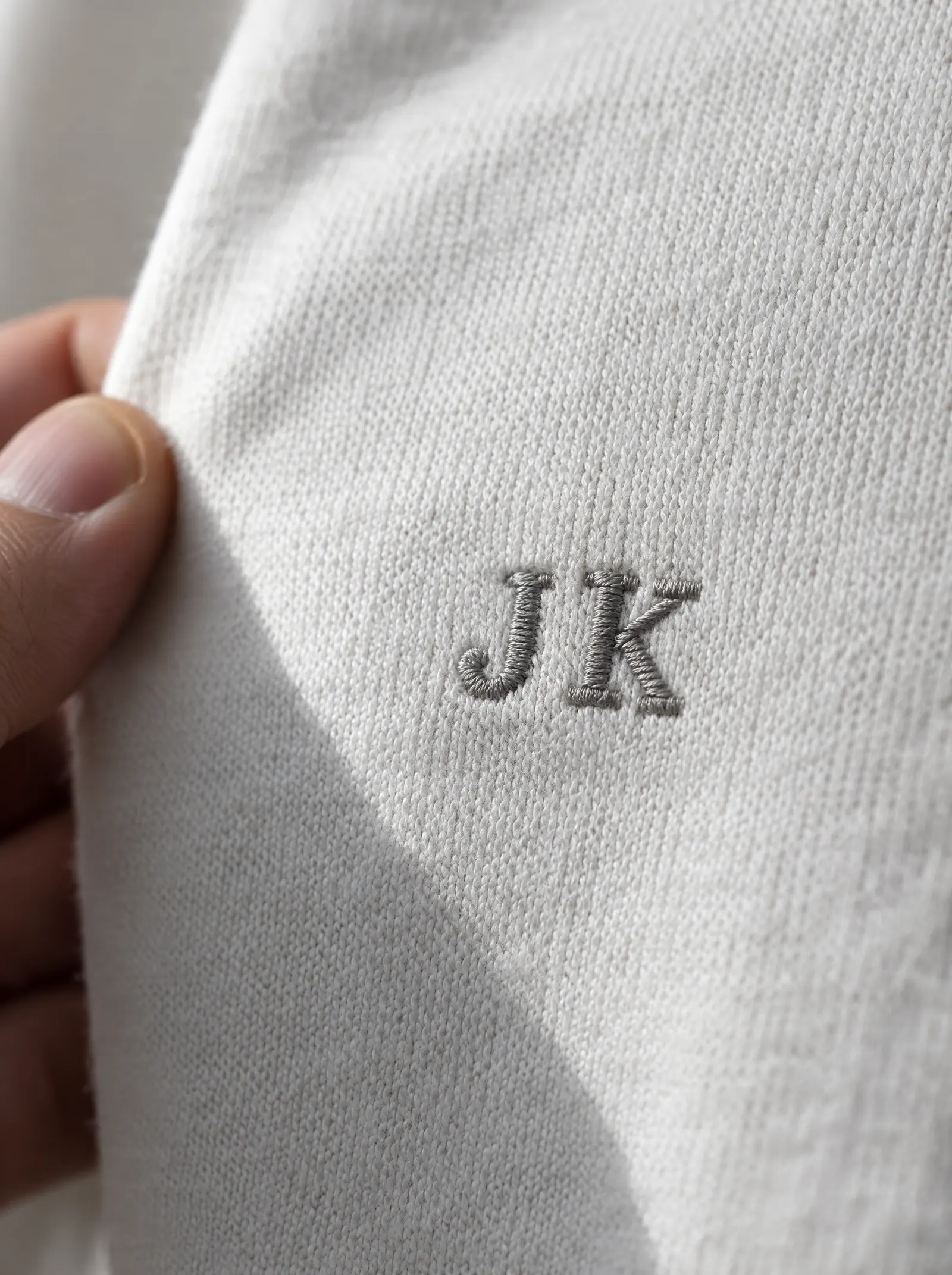
- Text height: at least 5 to 6 mm, or the openings in letters fill with thread. See embroidery digitising explained.
- Stroke thickness: about 1 mm or more. Thinner parts cannot be formed in thread.
- Simple faces only at small sizes. Thin serifs, script and condensed faces lose their shape.
Fonts that work on shirts
- Bold geometric or grotesque sans serifs: clean, modern, read well at any size.
- Slab serifs: sturdy serifs that survive print and suit a heritage or varsity look.
- Condensed bold faces: fit a long name across a back, as long as they stay large.
- College and block lettering: made for garments, ideal for fests, teams and names.
Fonts to use with care
- Thin scripts and handwriting faces: look delicate on screen, break up on cloth. Use them large, or not at all, in embroidery.
- Hairline and light weights: disappear on textured cloth and from a distance.
- Distressed and grunge faces: the texture can look like a printing fault rather than a style.
- Very decorative display faces: fine for one big word, hard work for a sentence.
How many fonts?
One or two. A strong face for the main word and a plain one for anything else is plenty. Mixing three or four faces on a single shirt looks busy and reads slowly.
Colour and contrast
A good font in a weak colour still fails. Light grey text on a white tee, or navy on black, loses its letterforms. Check the design in black and white on your phone: if the words are hard to read, the contrast is too low. Choosing t-shirt colours covers this.
Names and numbers
Personalised shirts, with a different name on each back, need a face that handles every name well, short and long. Test the longest name on your list, not the shortest. Keep the size the same across shirts so the set looks uniform.
Font licences
Fonts are software, and most come with a licence that says how they may be used. A font that is free for personal use is not always free for commercial use, and printing it on shirts you sell or give away for a business can count as commercial. Some licences treat merchandise and products for sale as a separate use.
Before you finalise a design:
- Check the licence of every font in it, from the place you got it.
- Prefer fonts licensed for commercial use, or open licences that allow it.
- Keep a record of where each font came from.
- Turn text into outlines in the final vector file, so it reproduces exactly as designed.
If your company has brand fonts, use those: your designer will know the licence terms.
A quick font checklist
- A sans serif or sturdy serif in a medium or bold weight.
- Text at least 3 to 4 mm tall for print, 5 to 6 mm for embroidery.
- Strokes at least 0.5 mm for print, 1 mm for embroidery.
- No more than two faces.
- Strong contrast with the garment.
- A licence that allows commercial use.
Try your lettering on a shirt in our t-shirt design maker, or send us your design. You approve a mockup before anything is made, and changes to it are free.
Quick answers
What is the best font for a t-shirt?
A sans serif or sturdy slab serif in a medium or bold weight, with open shapes and even strokes. It reads from a distance and survives print and embroidery. Thin scripts, hairline weights and very decorative faces break up on cloth.
How small can text be on a printed t-shirt?
As a rule of thumb, about 3 to 4 mm tall at the very least, with strokes no thinner than about 0.5 mm. Screen printing can fill in very fine text; DTF and DTG hold fine detail better. For embroidery, keep text at least 5 to 6 mm tall.
Can I use any font on a t-shirt for my business?
Not always. Fonts come with licences, and one that is free for personal use may not allow commercial use, including merchandise. Check the licence of every font in your design and keep a record of where it came from.